Lightroom for iPad: Generative AI

I recently upgraded to an iPad Pro 13” with the M4 chip for no better reason than John Gruber’s assertion that “a Lexus is nicer than a Toyota”. This prompted me to do a deep dive into apps for photo processing raw files from my iPhone 14 Pro Max and my camera, an OM Systems OM-1. I’ve collected a few apps over the years, but none of them really stuck apart from SnapSeed, which works well for editing JPEGs, but raw not so much.

I’m a big fan of Skylum’s Luminar Neo on my desktop machine, so when they released Luminar Mobile I sprung for a subscription without properly testing the app. Big mistake! The results are okay, but the interface sucks. The designer’s appear to have eschewed the conventional slider and used every control widget in the library for no good reason than to use every control widget in the library. Almost every adjustment would be more easily made using a slider from x to y. Skylum recently introduced a new version with a change of name, but no improvements to the UI. I have cancelled auto-renewal.

Many years ago I was a user of Adobe Photoshop and Lightroom on Windows, but the subscriptions became too expensive for my amateur use. I had a big fight with Adobe when I tried to cancel my subscription, which they eventually did, but it left a sour taste so I’ve avoided their products ever since. But time heals all wounds 😀, and I decided to take a look at Lightroom for iPad. It didn’t take may days of the free trial to convince me to take a subscription. The app gave great results on every image a threw at it: iPhone files JPEG, raw and ProRaw, ORF files from my camera and DNG files output from DxO Pure Raw 4 (highly recommended also), which I loaded into Apple Photos.

This post isn’t intended to be a review of Lightroom for iPad. What prompted me to write it was a newsletter plugging the “best retouch tool” on iOS. I haven’t had much occasion to use the Generative AI feature in Lightroom, so I tested it on this image:

Image of tarmac with cement repair surrounded by garbage bins
The original image of a tarmac repair

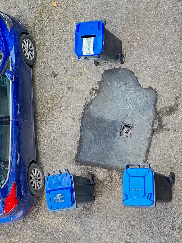
First I removed the bins:

The bins have been removed

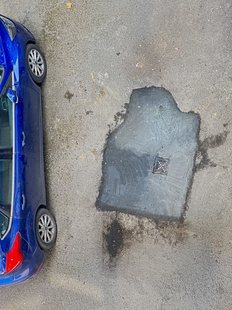
Even the small section of the cement repair at the bottom right has been convincingly generated. Some dirt where the bottom left bin was standing has been added.

Next I removed the car:

The car is gone

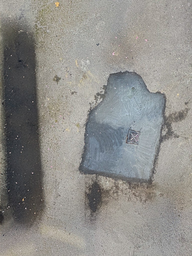
The app has generated a dark area indicating some stain or damp under the car, though its shape is odd.

Tweaking the stain

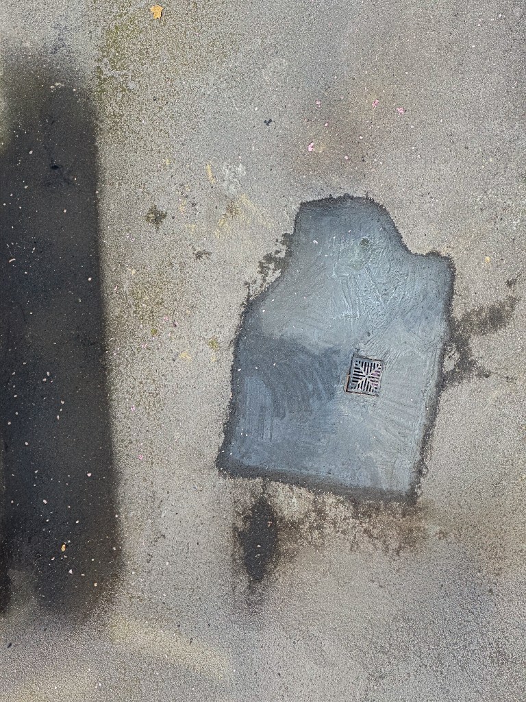
For the final edit, I adjusted the darker area so it reached the edge of the frame. The final result is amazing!

Georgia

I’m not going to do a full-blown review of my new iPad Pro, which I’ve christened Georgia (it’s just easier to keep track of the all the iPads and iPhones when they have proper names).

This is what I wrote in DayOne on the day that Georgia was delivered.

These are some impressions from using the iPad Pro for a week or so. The Smart Keyboard and Apple Pencil arrived yesterday, so I’ll gradually expand this post before I publish it.

Georgia is no lightweight. You can hold the iPad Pro with one hand, but I wouldn’t want to for any length of time. But I was surprised how quickly I got used to the size. The first evening I sat on the sofa playing with Georgia, installing apps, organising folders and just generally trying different things out. After a few hours, I put Georgia aside and picked up Nikki to take her to bed. Nikki—my iPad Air 2—seemed tiny. [Read more…]

IOS Automation: A Beginner’s Story

I have had the Drafts app on my iPad for some time, but haven’t used it a great deal. Recently, I decide to see how I could make more use of its capabilities.

[Read more…]

A Quick iOS Keyboard Trick

Unapologetic: A Quick iOS Keyboard Trick.

What many people (myself included for the first three years in which I used an iPad for almost all of my typing) don’t realize is that if you tap on that key and then quickly swipe upwards it will immediately insert an apostrophe. Tapping and holding to reveal deeper functionality within the main keyboard keys is no secret, but what makes this key special is that there is no need to hold. As quickly as you can tap and swipe upwards and let go of the “,!” key is as quickly as it will place the apostrophe. This is significantly quicker than any other method of inserting an apostrophe, even using the apostrophes located on custom keyboards in apps like Drafts or Editorial. The exact same functionality works on the “.?” key, but inserts a quotation mark instead of an apostrophe.

I’ve experimented further and it appears the touch and swipe up will work any key on the keyboard that has one extra character definition like the apostrophe and quote that Alex mentions. (If you touch and hold a key, you’ll see what other characters are defined, e, for instance, has 7 with the various diacritical characters that can be stuck on). The period on the numeric keyboard produces an ellipsis when you touch and swipe. The w gives ŵ. The number ? puts out ¿. There are a few others.

I think what is happening that the iPad doesn’t need to wait for you to make a choice on the alternative character, but reacts to the swipe and outputs the alternate. Of course, you’re probably not going to remember all the alternates—but I do like to use the ellipsis.

There’s obviously some deeper meaning behind this operation… because I also discovered that the apostrophe on the number keyboard has three alternate characters (left and right single quotation marks, and what looks like a grave accent). Whatever character is chosen when this key is touched, the keyboard immediately returns to the letters, which doesn’t happen on any other key.

Automating iOS: A Comprehensive Guide to URL Schemes and Drafts Actions

Automating iOS: A Comprehensive Guide to URL Schemes and Drafts Actions – MacStories.

A really excellent explanation of how to build actions to work with Drafts and other apps that understand URL Schemes.

Update: Should have given credit to Paul Dutka who emailed me the link to this article.

Popsicolor Postcard Update

In my last post about photo painting, I mentioned that I’d sent myself a postcard using Popsicolor’s integration with Sincerely. That postcard has now arrived. I placed the order and received an acknowledgement email on 21 October; on 23 October, I received a despatch notification; the card arrived on 28 October. It is a standard-sized postcard with what looks like a medium-glossy finish. It’s a good quality print and looks very attractive. My wife saw the card propped on a shelf and commented on its quality without knowing it was an image I had created.

The cost for this one-off postcard was USD 2.99, which I don’t think is wildly expensive. It’s possible to buy credits that reduce the cost: 249 bucks gets a price of just under USD 1.70 for an international card. The cheapest bundle is USD 9.90 and gives a unit price of USD 1.98. “Domestic”, by which I assume they mean US, costs half as much.

I think I will be using the service again.

Popsicolor - 33

Photo Painting (5): Some More Apps

I’ve been continuing my search for good and fun photo painting apps. Today’s post looks at four more.

Painteresque

Painteresque works like many of the photo painting apps: choose an image from the camera roll/albums or take a picture and then apply a style. There are eight choices (Painteresque 1 and 2, Lithograph, Coloured Pencil, Charcoal, Rainbow, Mars and Portrait) plus “do nothing” that allows you to see the original photo. The results that this app produces are pleasing, but they don’t really turn your pictures into an oil painting or watercolour, or… The effects, as you can see from the examples, are more like a filter effect. The progress messages made me chuckle, “Narrying the Wembits” and “Magic Scrooberizing”.

There are controls that allow fine-tuning on quite a number of parameters; some producing weird results, but the effect is still that of a filter. And perhaps, that’s the main problem with this app: the name does not match the product. Still, as I’ve said, the final pictures are attractive, though I suspect (but could be wrong) there are many “filter apps” that produce similar output.

A nice feature of Painteresque is that should you happen upon a combination of these settings that pleases you, it’s possible to save these as a preset.

Pages: 1 2 3 4

Photo Painting (4): More Haikus

While continuing my exploration of Haiku HD, I discovered that the developer, Jixipix Software, has a version for Mac OS X for £5.49. I got my copy from the Mac App Store, but there’s a Windows version available from the Jixipix site. As far as I can tell the desktop Haiku is almost identical to the iPad version: there is an additional adjustment, Colour Vibrancy, and images have to be dragged into the working area and selected using Finder. I load all my processed images in JPEG format into iPhoto. I found I can browse in iPhoto, and choose to reveal a selected image in Finder, which I could then drag into Haiku.

The extra space of my iMac made it easier to do some testing; so I’ve created a few samples to illustrate the possibilities of the app. It’s, by no means, exhaustive, but it does give a flavour of the output options.

Haiku Adjustments

Haiku Adjustments

  • Colour Style: specifies where the watercolour appears on the image
  • Strength: changes the opacity of the watercolour effect
  • Wet Edges: changes the size of the outline around the water-colour effect
  • Paint Fill:changes how much of the image is covered by the watercolour effect
  • Paint Variation: changes how the paint looks in the selected area
  • Ink Outlines: changes the outline of objects in the image
  • Ink Outline Detail: changes the level of detail
  • Ink Fill: increases ink amount in darker areas of the image
  • Ink Colour: changes the colour for ink outline, detail and fill (has input from pointer and RGB values)
  • Colour Vibrancy: enriches the watercolour pigment
  • Paper and Borders (not shown): choice of background (42) and borders (14)

Pages: 1 2 3 4 5

Photo Painting (3): More Wasted Hours

I’ve been playing some more with Haiku HD. I’m beginning to understand the effects of the various controls, but I’m still a way away from being able to anticipate the final image. As a further illustration of the app, I’ve created a gallery using some of my pictures of Barcelona’s Sagrada Família. If you haven’t visited this amazing basilica yet, you should. Put it on your bucket list. And Barcelona’s a pretty good place anyway.

I wasn’t systematic about choosing or processing images. I usually started with a preset (supplied or custom) and then tweaked until I thought, “That looks OK.” So here’s the gallery; you can find the originals somewhere here.

Photo Painting: How To Waste Hours (2)

Continuing from Part 1, here are some more apps I played with. One thing, I should have mentioned is that I’m only looking at iPad versions of any apps. Many of them do have iPhone versions, but I expect that I would transfer iPhone pics to the iPad for editing on the larger screen.

SketchMee HD

There is a Lite version of this app, but after playing with it for a little while, I decided to spring for the full HD. There are a number of additional features; key ones for me were the increased picture size (for export) and detail level, and the ability to save direct to the Photos Roll rather than using email or out to social media.

SketchMee Controls

SketchMee Controls

Click on a button to adjust settings. Crop and Save are obvious. Other choices affect technique (pencil/chalk, coloured/not), detail, number of shades, number of overlapped strokes, intensity of shading, tip (levels of hard to soft), paper, paper colour, colour effect and strength of effect.

Somewhere in Rhodes

Somewhere in Rhodes

SketchMee seems to me to give more realistic simulations of pencil sketches than, say, SketchGuru.

Copenhagen Harbour

Copenhagen Harbour

Coloured chalk was fun, though I can’t say how realistic the effect is.

Poppy

Poppy


PaintMee HD

I was sufficiently pleased with the results of Sketchmee HD that I decided to press the buy button on one of the developer’s other apps: PaintMee HD. Basic operation is the same as SketcheMee, though obviously the controls are more relevant to oil painting.

The results from PaintMee aren’t as satisfactory as SketchMee.

Somewhere in Rhodes

Somewhere in Rhodes

Copenhagen Harbour

Copenhagen Harbour

There’s not much variation in the direction of brush strokes. This is particularly obvious in the sky in the harbour scene. What works well for pencil sketches does not seem to be so good for oil paints. Compare this interpretation from AutoPainter (Frank Benson treatment):

Somewhere in Rhodes (Benson)

Somewhere in Rhodes (Benson)


PhotoArtista – Haiku

The last app in this post, I’ll call Haiku HD because that’s the icon label not the name in the App Store. The output from Haiku is harder to characterise than the other apps. It’s sort of watercolour, but with extra. The website calls it “… a compilation of whimsical stylistic water-colour poetically brushed to aged or artistic paper then outlined in india ink”. Haiku comes with two sets of presets— Abstract Watercolour and Stylised Watercolour—and you can create your own presets. There are sliders for strength, wet edges, paint area, paint variation, ink outline ink outline detail, ink fill, and ink colour. The effect of some of these is obvious, but others aren’t quite so straightforward, plus it seems the effects can be applied to shadows, mid-tones, high-tones or the full image.

I’ve spent some time playing with the presets and adjustments, and haven’t worked out what to expect, so I’ll just present some examples. The output from Haiku does have a certain charm.